This is the development progress for my magazine cover
Research
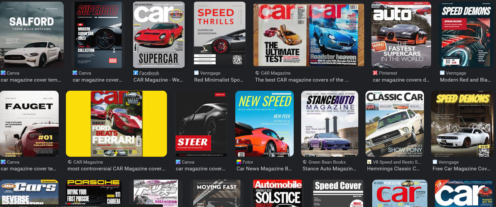
To me I do like the type of shots that these car magazine covers take, a nice long shot or close shot of the car in the detail really directs the eye of the audience. Though as seen in the offroad car magazine cover a convention it has is that it is filled with coverlines and different colored fonts and typefaces. To me I think this wouldn't fit the jimny as since I can't do crazy jumps or run through mud with the car. Therefore I try to go with a professional, low-energy look with the jimny parked.
SKETCH #1
SKETCH I CHOSE
FIRST DESIGN
In the first picture of the sketch all I did was laying out the masthead and the cover lines that I was planning to put. Then I tested out on some type faces that would match the genre I was going for which is offroad.This time my teacher told me that I needed to add some broders to the cover, I did ths by adding the ruler feature to the website (canva) I was using. This made it look more structured but It wasn't really the theme I was asking for, the typefaces does not look neat and the picture's colors was too plain, I wanted it to be more orange and making the jimny the main focus.
I color graded the image to make the background more orange and I tried to highlight the jimny just by making the image colder and the background warmer. From the vast background I took a picture of, I as well zoomed in the image to give more attention to the Jimny. Then I asked my friends next to me to decide on what typefaces should I use, they recommended to use a bold typeface for my masthead to make the audience know that "offgrid trails" is the masthead. As well for the main coverline I tried to add a background to the text but it didn't really seem to match well with the background. Another change I made as well was to the coverlines, I made them white and a different typeface to the masthead. I think this matches better than the typeface I used on the previous picture.
I got some feedback from my teacher, I was told that I should reconsider on using a white border as It wouldn't make my magazine stand out and its not noticable. Thus I chose brown as my border color, I asked my friends for feedback and they said it matched so I stuck with the brown color. Then I also removed and changed my main coverline to "Japanese Legend" with a yellow ish font color, also making the other coverlines smaller to make the main one stand out more.
Finally for the first concept, I added some more coverlines on the left and right bottom of the cover image and lowered the main coverline to not block the jimny.
Second design
A convention of a usual offroad magazine is that its filled with coverlines with different text colors and crowded with different typefaces and long shots of cars. Though I felt like that diverts away the attention I was trying to seek which is trying to mainly focus on the jimny, therefore I would subvert the this convention by going for a professional, clean design.
First of all I took a medium shot of half the jimny, to use it as my main image . Though the brightness was too bright as I took the picture at daytime during a sunny day, so It didnt really fit in with the mis-en-scene in the background. To fix this, I used an application called Adobe Lightroom that allows me to control the color grading of the picture. The Idea I tried to portay was to make the jimny look menacing and scary, I tried to do this by highering the contrast and lowering the brightness to as well macth the mis-en-scene in the background. I also used the masking features that creates a gradient on the sides of the image , basically a dark viginette. I asked opinion from my friends next to me and I got positive feedback, in result I decided to use this image.
I proceeded to add my masthead and coverlines to the picture. I tested out loads of typefaces and asked opinions from friends around, since I didn't have canva premium, the amount of typefaces I was permitted to use was little. Thus I spent lots of time trying to find the right typeface. I tried editing the font as well such as adding an underline but It wasn't enough. And the main coverline didn't seem to stand out as much. I got feedback from my teacher that I needed to make my main coverline stand out, then he told me to dragdown the text, Increased its size and change the color. Till this point I am satisfied with my layout of the coverlines. though my teacher pointed out a detail that didn't look neat which was the spacing between the text. A text allignment feature in canva allowed me to tighten the spaces a little in the text to make it more neat.
Finally, I found the right typeface for the masthead and got approval from both my friends and teacher. I feel like I am satisfied with the design and like the overall style that I went with


No comments:
Post a Comment