This is My Double Page Spread: Research + Development


| Before Reading |
| Magazine: | Classic Mercedes |
| Issue: | Date of Issue/ Issue No.: Issue 44 Autumn 2023 |
| Publisher: | - |
| Genre: | Car genre |
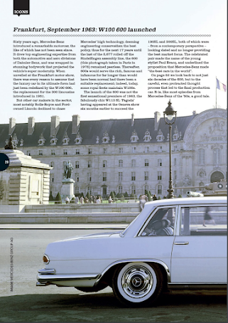
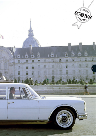
| Images: | Its an extreme long shot of a classical mercedes going through a street |
| Layout | This layout does not have a drop cap or page numbers rather its very heavy on the picture as seen that the text is overlapping the sky found in the extreme long shot. |
| First impressions: | The shot of the car is very interesting it really fits into its classical car theme showing related mis-en-scene such as the old-style architechture the castle which connotes a vintage old feeling. It successfully creates an old atmosphere which is fit for the car type. Though it is kind of hard to read the text and since its too heavy on the image the article seems non-existent and lacks attention. |
| After Reading |
| Heading: | Frankurt, September 1963 : W100 600 launched |
| Subheading: | - |
| Author: | - |
| Article: | The article tells a bit of history about mercedes ,how the car found in the picture is produced and launched in the market. It also tells how the picture was taken and where it was taken ( Paris) |
| Mode of address: | The article doesn't directly address the audience with "you" it is a formal and serious style text. It is trying to keep its elegance and reputation of the car being seen as a old but luxury call since its one of mercedes' iconic car |
| Pull Quote: | - |
| Audience: | As for demographics I think its targeted towards male of the age 40+
For psycographics its towards vintage car enthusiast especially mercedes cars. The mis-en-scene such as the soft, grey and white colors connotes a vintage, classical atmosphere. As well the mis-en-scene of the looks to be old person inside the car with the old style formal clothing as well demonstrates that the producer was trying to pretend that the image was taken late back in the days to portray that the car is a classic vehicle found only when it was launched which was in the past. |
| Impression: | The picture was fun to look at but it didnt take long for me to lose interest. I feel like the image is too dominating in the page which makes the article less interesting to read, as well the way the article is positioned, my eyes doesn't automatically tries to target the text rather only focuses on the image. By that I am trying to convey that the image is what gives the most attention making the article look out of place. |
| Inspiration: | I learnt that I need to be careful on how do I place my images to make everything equally entertaining, such as the texts and images |
\
| Before Reading |
| Magazine: | AutoBild |
| Issue: | 25 Jan - 7 Feb 2017 edisi 359 |
| Publisher: | Kompas Gramedia |
| Genre: | Car genre |
| Images: | 4 close shots of the interior of the mini cooper and 3 long shots to show the exterior of the mini cooper |
| Layout | a drop cap can be found on the top right, each text is placed in a column each page has 4 columns. The page numbers are barely seen on the bottom pages. |
| First impressions: | The big pictures catches my eye especially the big image of the car in the middle. Though it looks like the text layout is messy to me. |
| After Reading |
| Heading: | Versi Terkencang MINI Cooper Clubman |
| Subheading: | Tradisi terus berlanjut dan kini JOhn Cooper Works, rumah modifikasi MINI, meracik clubman agak amkin beringas dibanding pedahulunya. |
| Author: | Danang Wasito |
| Article: | the article talks about the statistics and the interior parts of the mini cooper |
| Mode of address: | No it does not address the audience directly but it uses informal language as a way it is trying to welcome the audience to find out about the car |
| Pull Quote: | None |
| Audience: | I think the audience is for car enthusiast, shown by the use and layout of the car images throughout the page |
| Impression: | I have an interest in cars so I find it quite interesting to read and look at the images. Especially the close up shots of the interior section of the car, seeing the details makes me more intrigued to read the magazine article. So in my opinion it has successfully captured my attention even though it looks a bit messy. By that I mean the placement of the pictures which looks too scrambled and random. |
| Inspiration: |
I learnt that taking the right pictures is key to capturing the audience's attention as what happened to me when reading this magazine, eventhough the layout isnt neat it still captured my attention and kept me entertained. I will take more caution on how I will take the pictures and make a more detailed plan to take the right shots |
A problem I have faced whilst doing this work is that It took time for me to analyse the double page spread such as what do I think about it and my impression. Its also difficult for me to get ideas from these as I only did two, I believe I would require to do more research in order to do my magazine project fluently. But a part i enjoyed was looking through car magazines, looking at different shots of cars gives me more ideas that can be useful for my project


No comments:
Post a Comment