Here is the preliminary research for my magazine to figure out the genre I was searching for.
This is the link to my double page spread research
https://bagasaja-regentsmediastudies.blogspot.com/2023/11/double-page-spread-research-development.html
A major problem I faced with this research is that my time management was horrile, I heavily underestimated this task and faced the consequences. I thought this task would take 2-3 hours, which in the end took me 4-5 hours to do. This has really opened me up and realise time management is key when I am in media studies, I will expect more thing sto come and I will be more prepared. Talking about the research, finding a car magazine was also difficult for me to find because at the time none of my friends had an extra magazine they could lend to me, so in the end I used other genre magazine for research such as fashion and architechture. The genre I chose for my project was automotive, thus in this research I have multiple genres. However, the multiple genres allows me to explore reasons and ideas on why was the magazine made that way. Such as why is there only a close shot of a watch used. It helped me develop ideas for my future magazine project which will come in handy when I need to start developing and creating the magazine

Magazines will compete against each other in order to get a proper position in the shelf. Usually the most recommended spot is at the very top or eye level. When people enter a supermarket, looking at a shelf they tend to look at the very top then to the bottom, therefore companies are willing to pay lots of money for the top position. As seen that magazines will rely on the upper third of the magazine to attract the audience's attention since it will be the most visible if they aren't placed at the very front . Because of this it makes me more aware of where to place these taglines and masthead. I will take note of this to make sure that my design will be capable of attracting and standing out among competitors. Instead of mainly focusing on making it beautiful I also need to figure out ways to market it properly via placement of texts.
The time place magazine
The time place magazine is filled with information perfect for timepiece enthuasist.
Media language
The typical convection for a branded watch magazine is that it will have a luxurious and elegant look on the front cover. The time place magazine has conformed to that convection by including a close shot of a Piaget watch. The metallic-grey color in the background of the magazine makes it feel more mature and natural, since the magazine wants the audience to full concentrate on the watch presented. As seen from the bright lighting that highlights the details of the watch. It clearly shows that the magazine is targeted for people that has an interest in collecting watches or loves fashion. It can also be seen that the coverlines surrounds the main image ( the watch) to further direct their attention to the middle row of the magazine. To add with the words such as "MY FINEST HOUR" and "Life's Special Moments" connotes the feeling of elegance supports the convection that the front cover is trying to represent.
Representation
Branded watches are represented as rich items that complements well on fashion. In this magazine, it may be targeted towards men of middle aged around 20-30. The color grey connotes a sign of dominance and strength, the front cover has succesfully conveyed this convection.
Audience
The time place would target mostly people who has an interest in watches and loves fashion. According to the Uses & Gratification theory by Bulmer & Katz, the audience would read this magazine for surveillance, since they can might be interested in watches or fashion. The appealing high quality image of the watch facing upwards towards the audience would be the main hook to attract their attention. The bright lighting allows the watch to be seen more and gives a more lush affect, it would be difficult to not look at the magazine if I were to be a watch or fashion enthusiast .
Industry
The company has always used this method and design on their front cover with a certain type of watch as the main image. Though the watch brands vary on each version of magazine to create a diverse selection for audiences to choose from. The company also provides a website which shows all of the versions of magazine and an option to download the PDF online version of the magazine.
Asri Magazine
This magazine discusses about architechture
Media Language
A usual convection for an architecture is that it shows their creations or designs via a long shot, extreme long shot or an establishing shot. In this cover, the magazine uses a long shot to allow all of the details and furniture to be seen clearly in a high quality image. The colors are warm and mostly green, this connotes a cozy, comfortable and relaxing. Mis-en-scene such as the plants give the picture a more natural feeling, it shows that the magazine is trying to target people who loves greenery and loves the ecosystem. The use of the lighting in this cover is one of the key elements to enlighten the scene. The reflections on the furniture attracts attention to force the audience to focus on the detail.
Representation
The green color brightening the room, the wooden furniture and the plants. All of these aspects in the main image of the magazine represents mother nature. It connnotes a tranquil, soft ambience to the magazine. It shows that the magazine is trying to target audiences that are interested in nature as well as like the idea of being relaxed. This is a general convection of natural materials such as wood or the green and yellow ish colors that it creates a natural feeling as if the audience was in the wild like in a forest.
Audience
This asri magazine targets people of the age 17- 60+ , specifically people who are interested in furniture designs such as this. Relating to the Users & Gratification theory by Bulmer and Katz, audiences may read this magazine for Surveillance. The high ,quality long shot the interior of the house represents the whole magazine of what the audience is about to expect. Therefore with all the mis-en-scene included in the main image audience may derive information about furniture or architechutral education. I like the use of lighting used in the main image because it really brightens up the area and reveals the whole idea of the magazine, it has succesfully caught my eye. However, as I am not into both architechtural or furniture I still have an interest in the magazine. According to thte users and gratification I am reading this magazine for diversion. Another detail I like is that its not only for education though the successful development of the soft and soothing atmosphere that the cover has given. Audience would love to take their time and read this magazine to enjoy the relaxing moment as going through the magazine.
Industry
The green and natural furniture and arhictechtural can make this magazine stand out amongst other modern magazines in the same industry. This is because a normal convection found on modern furniture magazines is that the mis-en-scene found is mostly marble and concrete, the color dominant is white. Knowing this Asri can create a Unique Selling Point by appling its natural, wood designs to the industry.
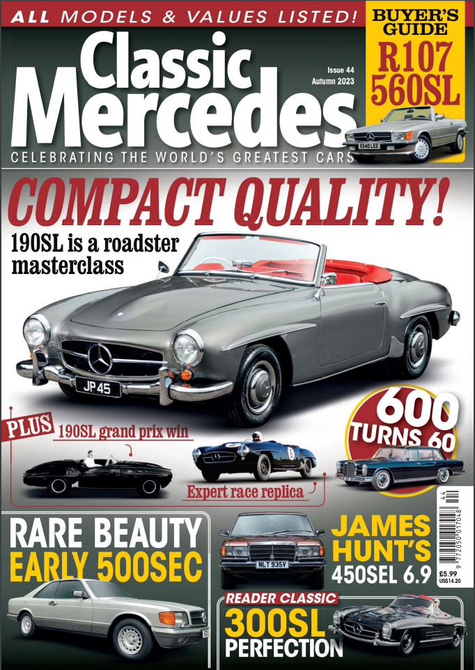
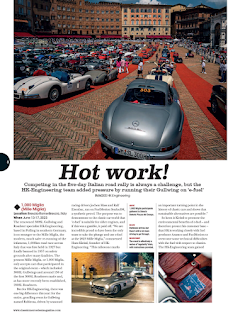
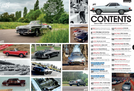
Since I am thinking of doing a car magazine I can use this as inspiration to bring up new ideas to my magazine. Starting off with the main cover, a convection for old cars that it displays elegance and formality. As well it is mostly targeted to people aged 40-70+, people who enjoys collecting cars or loves classical old cars. However, this magazine subverts the convection for the old cars. This is becasue as seen from the main cover that its too crowded and makes the cover look "cheap" not really trying to focus on one car but to many different cars. The contents page looks cool to me, eventhough it is still crowded, the long shots of the cars gives variety with many things to look at. This allows audiences to spend more time looking through the cars.
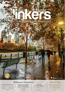
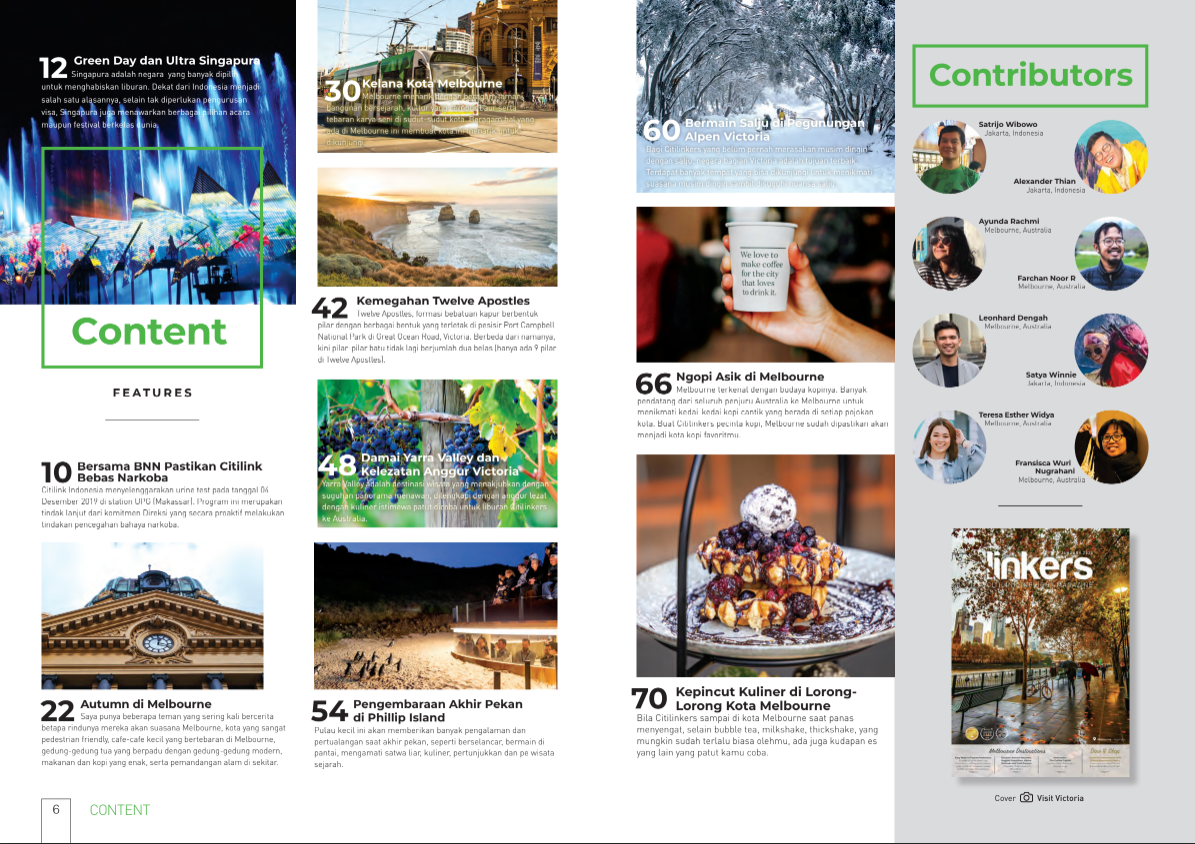
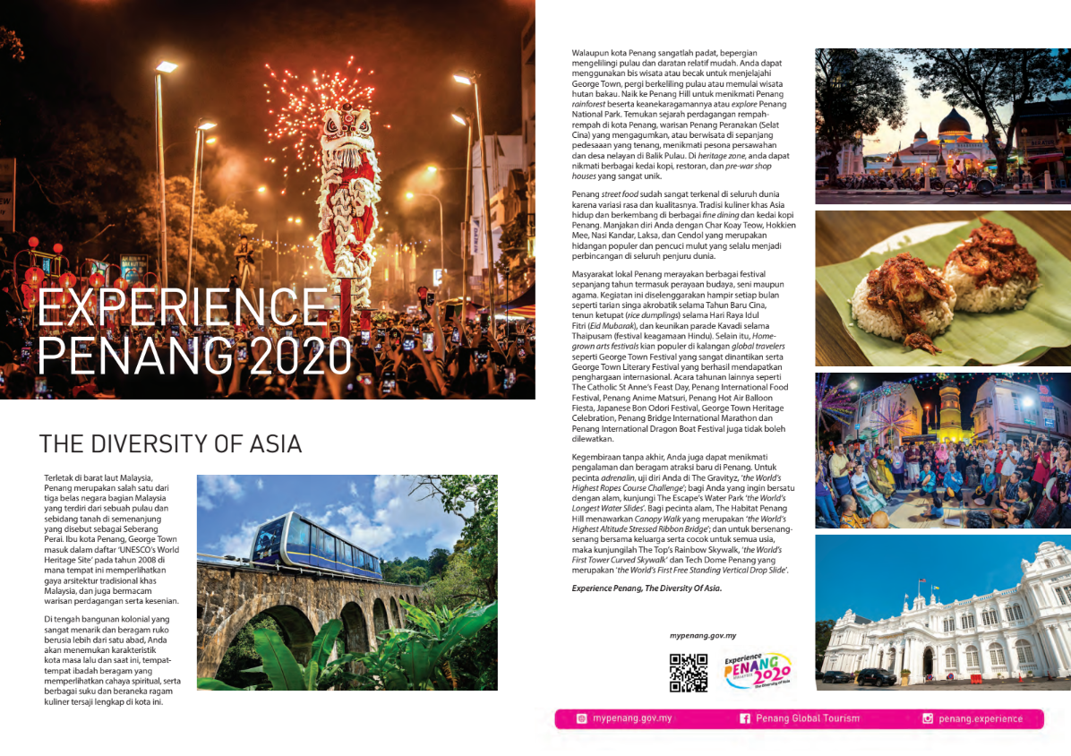
Though I am doing a car magazine, this magazine has a good structure that I like. The main cover image gives out a relaxing vibe and ambience to the magazine especially with the main image covering the whole cover. It looks like the magazine is targeted towards teens at the age of 16+, the colors are bright, the mis-en-scene in the images creates an aestethic vibe as the audience reads through the magazine. Eventhough I aim to not create the same vibe instead I aim for a manly vibe, I can learn from this magazine on how to position my images and take the right pictures.
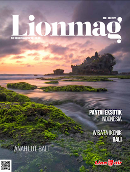
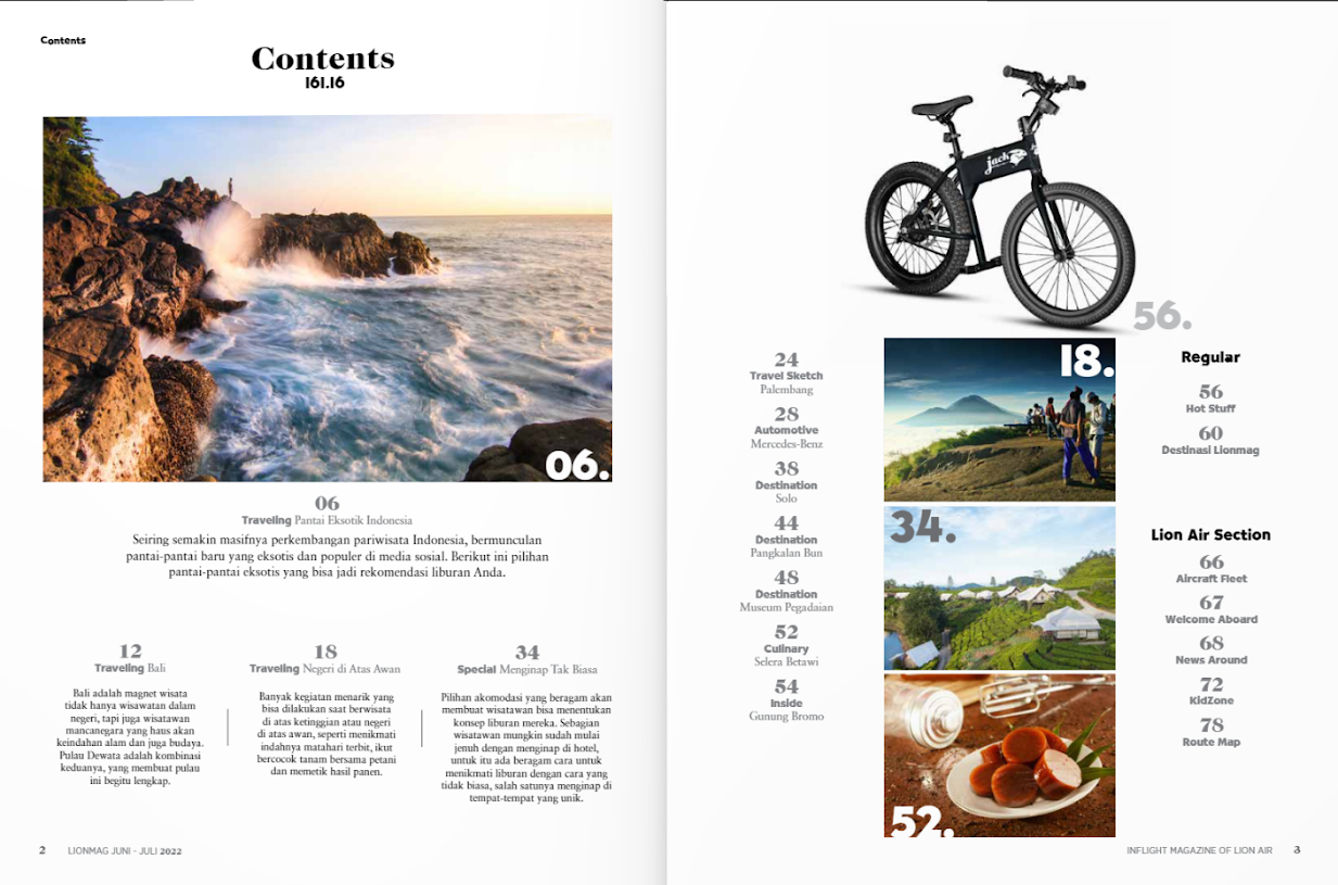
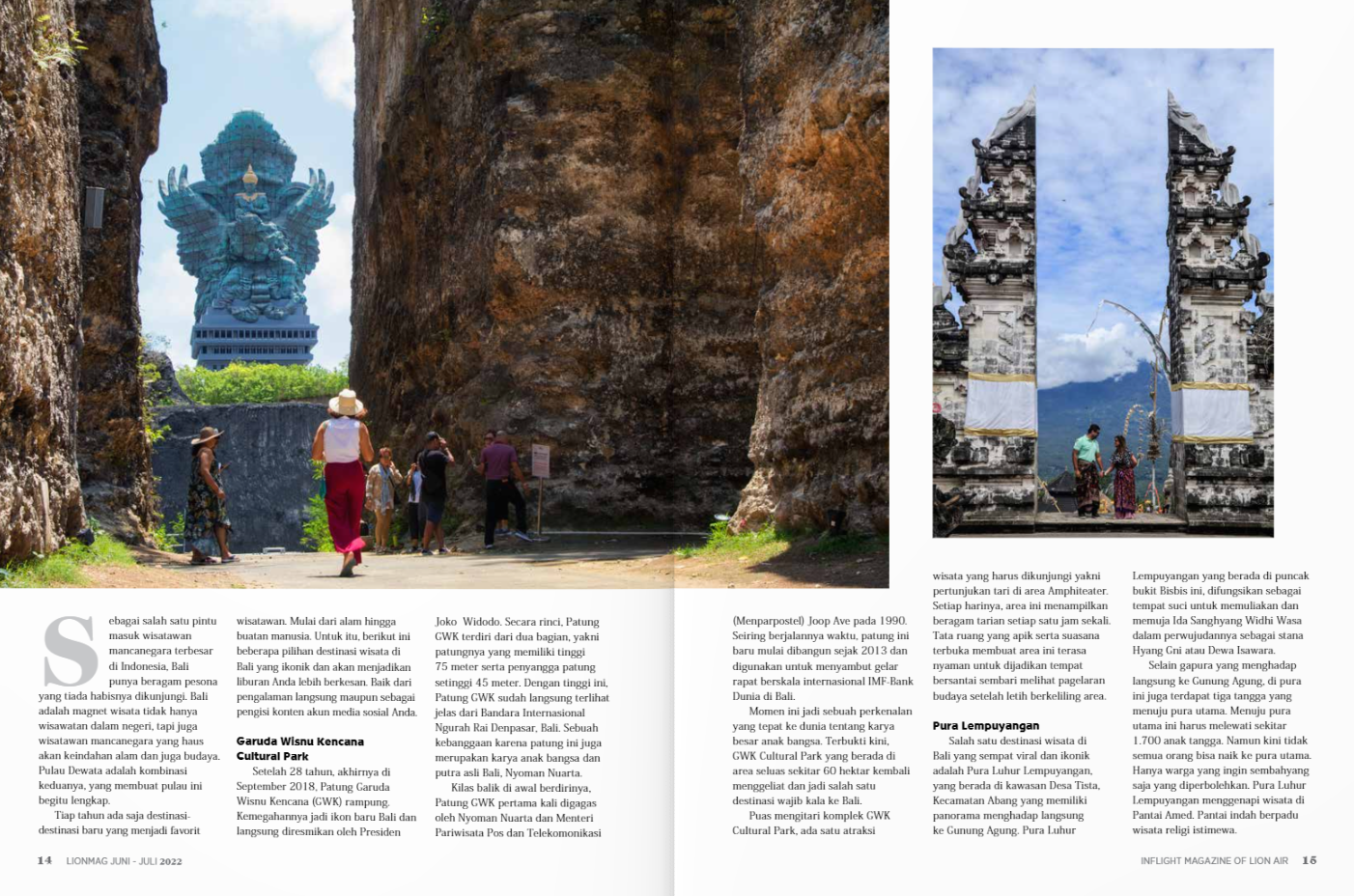
The design of the magazine to me looks simplistic, this is because the producer is trying to let the pictures take most of the audience's attention. The magazine is trying to target audiences at the age of 15-20 above , mostly to both of the genders. The cover's typeface consist of large text or the masthead "lionmag" in a white font and not a lot of coverline can be seen. Because of this I can derive that the producer is mainly relying on their photography and scenery in order to catch the audience's eye. Though this is clearly targeted towards a mass market as it doesnt specifically target a niche portion of people, it just shows the beauty of Indonesia. For me this might not suit my idea for the magazine as I will have have to target a niche portion of people, so I may have to add more coverlines and more diverse images in order to keep the audience entertained.
\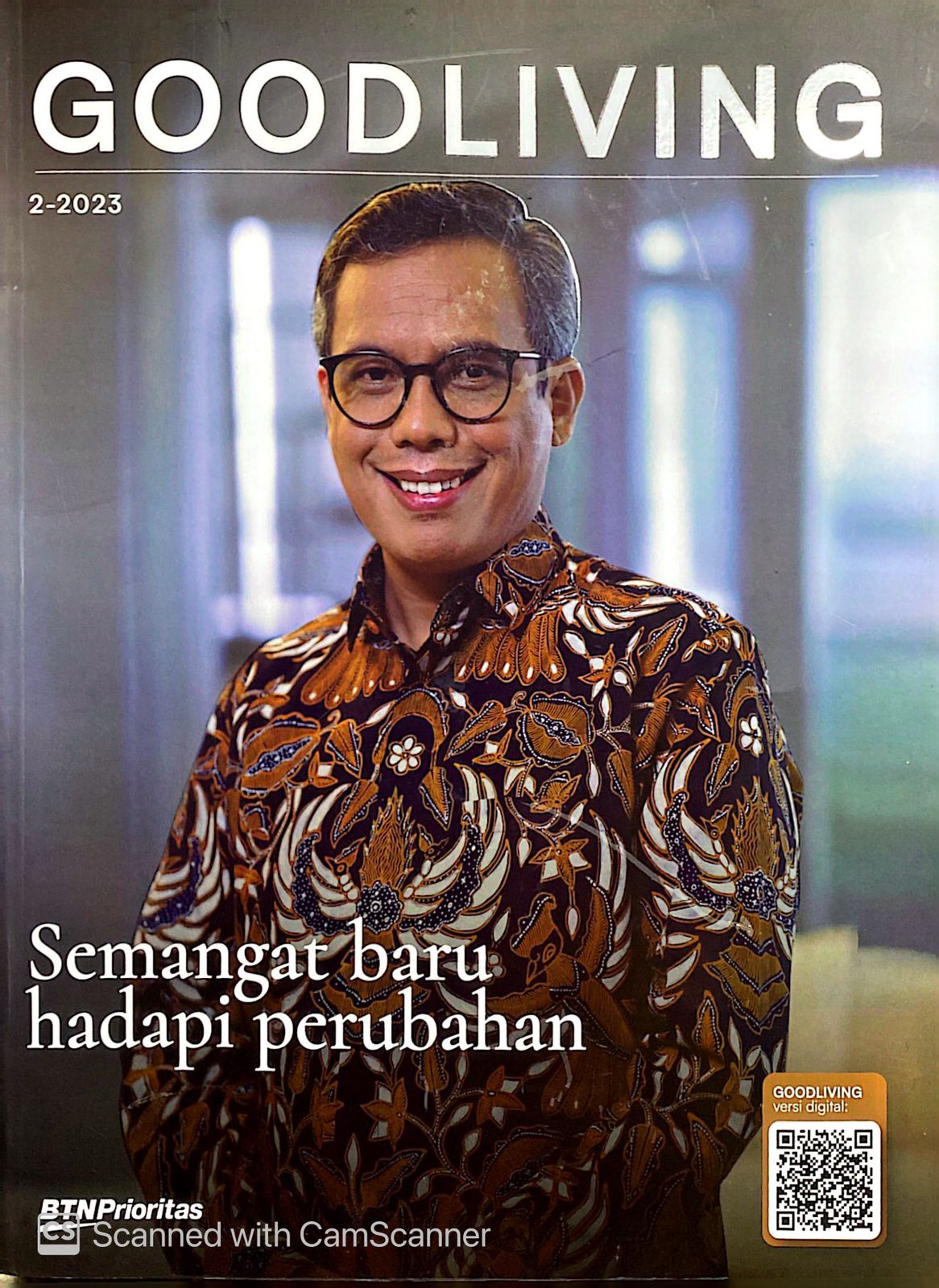
First of all I dont like the magazine cover , It doesnt really attract my attention maybe because its because its not targeted to me but to people ages 40-50 years old. However the use of different colors and the unique positioning of images in the contents page is an aspect I like in this magazine. The variety in colors gives more emotion to the magazine, a technique I would take note of to make my magazine. Finally the double page has used boxes to specifically highlight specific content within the articles, this is also a method I would like to take note of when making my magazine.
Here is a link to my double page spread research + development




No comments:
Post a Comment