Wednesday, February 21, 2024

Final Magazine

 Here are the Final images for my magazine cover, contents page and double page spread


MAIN COVER

CONTENTS PAGE


DOUBLE PAGE SPREAD


Here is the link to my pictures incase it doesn't load: https://drive.google.com/drive/folders/1q2okhlJpGnp0pCiYuyORwCevDlfscQ8C?usp=sharing

This is the link to my flipbook: 

https://heyzine.com/flip-book/6d51cf0897.html


Critical self reflection Magazine

 This is my critiaccl self reflection for my magazine project


Critical self reflections

Here is the link to my critical self reflection link if the slides doesn't load

https://www.canva.com/design/DAFul9skQOM/wA4E4wn3sFGKWlJ_ToG7XA/edit?utm_content=DAFul9skQOM&utm_campaign=designshare&utm_medium=link2&utm_source=sharebutton

Monday, February 19, 2024

Photoshoot (behind the scene)

 These are the pictures I didn't use for the magazine


These are the pictures I didn't use for the magazine project. I tried to take multiple shots of the jimny from all angles and all lense zooms. Such as the picture of the back of the jimny, the background was too revealing , it didn't look "offroad". The close shot of the interior of the jimny was good but the lighting and the angle was too perpendicular with the elements such as the steering wheel thus I cant highlight the details of the jimny. The  long dutch shot of the jimny from a high angle was too zoomed out and the quality wasn't good since my phone camera isn't good enough. The close shot of the wheel, the lighting was too bright and I couldn't find a use of the picture that would fit well with my articles. 

The rubicon was quite difficult since my dad uses the car most of the time so I had to talk to my dad about borrowing the car to do a quick photoshoot before he goes to work

Wednesday, February 14, 2024

Double page spread research and development


This is my research and development post for my double page spread


As for my research I noticed that most of double page spreads from car magazines, a usual convention from these magazines is that the images chosen are mostly long shots of cars to show the whole view of the car. Another convention I noticed is that I need to be careful of the shots and the type of layout I want to design, as since every positioning and every shot of a car gives out a different atmosphere. As seen on the Audi. A row of close shot images of the car is showed to give out detailed information from each picture, this shows that the magazine is trying to be informative and be professional. While as the blue Nissan r34 uses long shots of the car using different colors and unique text layouts such as the "fantasy to reality". This conveys a positive and energetic atmosphere to the audience . The energy that I am trying to convey is mostly a mix of trying to be informative while as giving it a colorful and bright appearance. I would probably need to do some more research though  I will try to layout my ideas through some sketches first. 


DESIGN


This was the rough draft I came up with after inserting the picture. At first I inserted a landscape low angle medium shot of the jimny, i tested out with other pictures and I think this picture fits the most. Though the mis-en-scene looked too bright and it wouldn't look professional, thus I had used the color changing effect of the background to make it darker. Then I had to input a layout for my text for it to fit  the whole double page. 


Then I had to move all the text and pictures downwards as my teacher reminded me to put the title of the article.


However I couldn't find a way to allign the text to the columns and make it neat, some of th text was overlapping the picture.


I didnt know what to do therefore I asked my teacher for help. Firstly the text was alligned neatly to make each column end at the same format. Then I decreased the font size to have more space. By then I Finally added tthe tittle and to make it stand out I made it a different typeface from the article and made it blue. 


I figured that the blue wasn't good enough looking and I couldn't get a good enough Idea. After asking my friends again I decided to give the jimny a warmer color as well as the title. The result was to me way better than using blue.


A noticeable change I did was the overall gradient of the double page spread. A friend pointed out to me that the jimny's color was too bright and it doesnt match with the text colors. After doing research on color gradient and looking at offroad car magazines, a convention was that it had more earthy colors. Using the color change feature in canva, I quickly changed the colors into a greener color to make it more nature related.


This is the final design I went with for the double page spread, I had conformed to another convention which was to have page numbers.


I did another adjustmet, a convention that these magazines had was that it had captions on the pictures below them. My teacher noticed this as well, so I added some captions right below the pictures

Monday, February 12, 2024

Contents page Research and Development

 This is the development and research post for my magazine content page
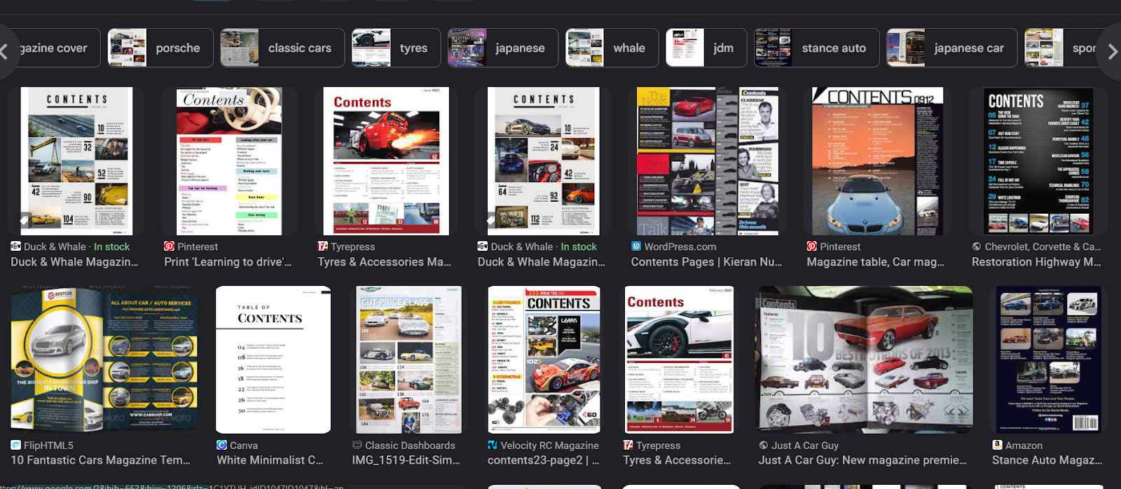


A convention of a contents page from a car magazine is that its filled with different cars and not only one car, as well it is filled with many pictures of the cars. To me especially the offroad car magazines it doesn't look neat and its not the type of style that I would go for. So I would subvert this convention by reducing the amount of pictures and typefaces within the page.


These are the type of layouts I would go for, though these are just quick random sketches out of my head I would ask my friends for more ideas.

 DESIGN 


As seen that I did try to follow my sketches but It just wasn't the design I was looking for , the pictures didnt fit and I didnt like the looks of it.

First of all at the first design, I didnt know what to do even after doing some research. I needed more pictures and I didnt have the idea. Though after going around google and finding idea examples I came up with the last two layouts. A convention of a offroad car magazine is that its very energetic and messy, though I didn't like it since it didnt look clean. Therefore I will subvert this convention and go for a professional style. At first I used a medium shot of the Jimny's engine to make it the main focus of the contents page as sice my double page spread is about the jimny. Then I used the grids to neatly layout the other 3 pictures on the bottom. The pictures chosen were what I think would be related to offroad. First was a long shot of the horizon in a field which could be thought as an offroad track, the two vehicle pictures is another offroad , a Jeep wrangler rubicon. Jeep is widely known for their tough all terrain vehicles, becoming synonymous for offroad topics. Though my dad doesn't use it for offroading purposes, the car is always capable of doing so. Hence, I would like to highlight the key elements of the car such as the close up shots of the Jeep logo on the steering wheel and the rubicon badge upfront, to give a further notice of the upcoming offroad related articles.  


. Next I properly laid out the page numbers using a small rectangle as a background to make it visible. By then I added all the contents texts. To make it in place and in structure, I used the rule and margin and follow the guides to not go out of the structure which I got help from my friends online for some feedback on how to make the text look more professional. However after I added the text there was still a lot of negative space found, therefore I added a small row which consits of the categories of contents within the magazine to make it look more filling, I even asked opinions from friends and they said they liked it as well.  Another convention I saw was that the contents page of car magazines mostly dont have  a page number on them, knowing this I will conform to this convention as since I wouldn't have enough space to put the contents page number.  


I got more feedback from my teacher, since offroading is associated with earth, dirt and mud, I have to follow those colors in order to follow the theme. Because of that, I changed the color yellow to a darker orange as well as the previous grey boxes is switched with a brown color

Theory of stardom

 In class we did a classwork on theory of stardom, this is the table we did  This the work we have done in clas which shows the differenfce...